ECG Outlier Analysis
Daniel N. Albohn
11/08/2017
Outlier analysis and graphing
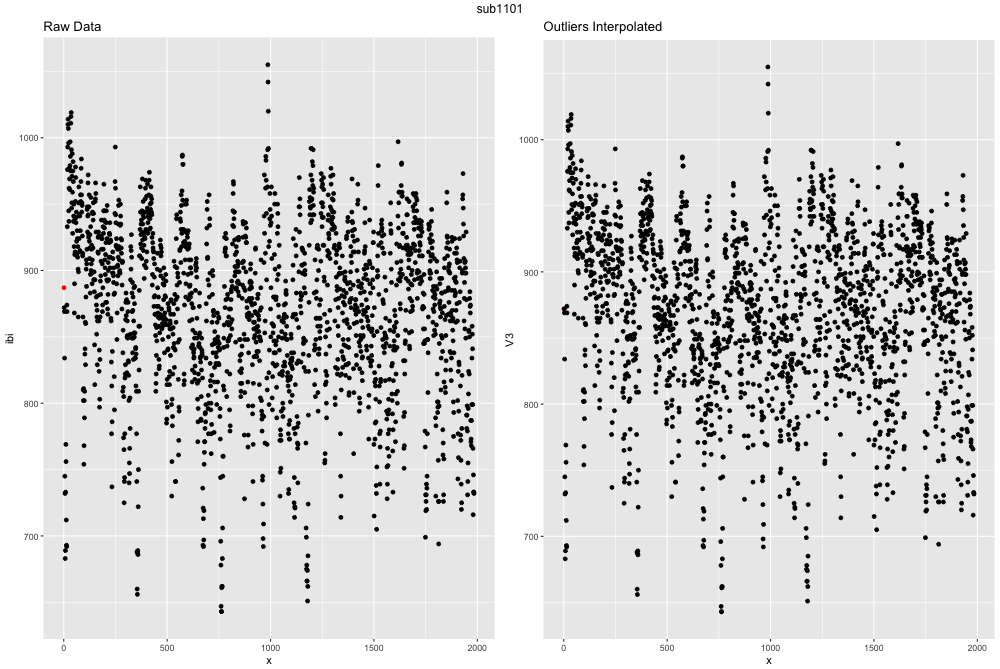
Finally, we have something from the raw data that is useable! We can take a look at how many outliers are present in our dataset and determine what we want to do with them. The easiest way to do this is to visualize the differences between the two. The function outlier_ibi() is a function I wrote to determine whether any IBI are > 300ms apart, and if so 1) remove them, 2) try and impute that missing point via a timeseries linear interpolation, and 3) plots the data before and after.
source('R/hrv_tutorial/physio_functions.R')

outliers_ibi(file = 'sub1101.ibi.gz', path = 'data/hrv_tutorial/')
example outlier image
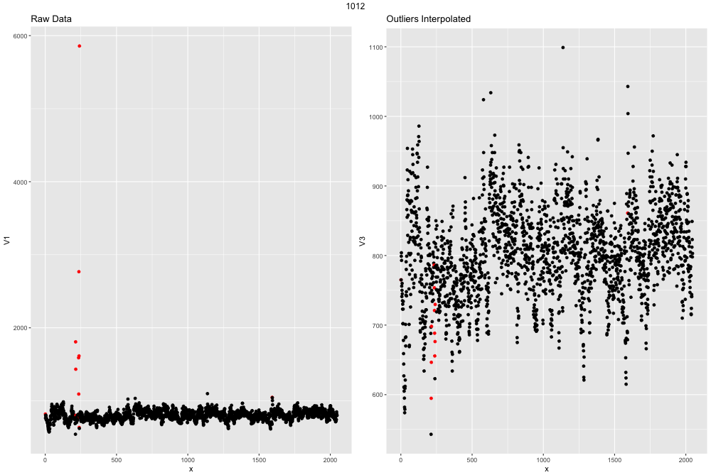
This ECG file is actually exteremely clean and well recorded. If the file had more outliers the graph might look like this:

example outlier image2
